SEX, LIES & BORDERTAPE: An Exposé on “Covering” Our First Year in Big Shout
Big Shout Magazine, March 1990
By GREGG KIRK
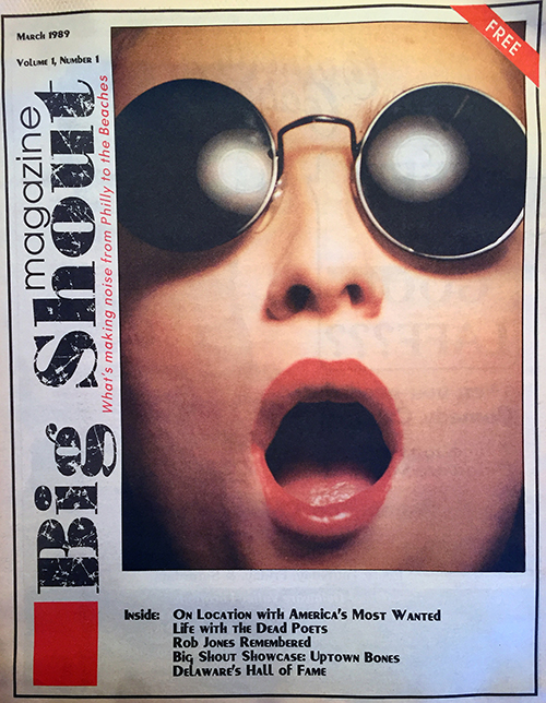
It all started a year ago in a profusely-lit room of a house in the suburbs of Wilmington, DE. There, three would-be shutterbugs trained bright lamps on and snapped shots of a young Harvard grad student wearing sunglasses and too much lipstick. The result was Big Shout Magazine’s first cover photo, which set the mood for a monthly tradition of bold, humorous, and even controversial photographs that have been gracing the outside of these pages for the past 11 months.
In celebration of the anniversary of this landmark event (cough, cough), we offer you a rare behind-the-scenes glimpse of what really went on during the shooting of each of these covers. Behind each issue lurks a story, and it isn’t always as pretty as the resultant photo.
If a picture speaks a thousand words, here are a few hundred more to help shed new light on the fine art of coming up with a cover concept at the last minute, overcoming incredible hazards and life-threatening circumstances, shooting the photo, getting it to the color separator at the last possible second, and acting like it was all no big deal.
This is our “cover” story, which concerns the effective use of sex, lies and bordertape.
March Harried
Actually, of all the cover photos taken, the picture for the first issue was the least stressful because it was shot more than a month before deadline. This was because it was used for the cover of our prospectus, which was a mock issue printed to give potential advertisers an idea of what the first issue of the magazine would look like.
Never again would anything concerning the cover be this relaxed. Cover model Ramona Szczerba showed up on time and didn’t have anywhere else to be that night. Glasses of wine were sipped, different ideas were thrown about casually… it all seemed so urbane.
The idea that we wanted to get across to our audience on our maiden attempt was to have an unrecognizable person shouting on the cover. At one point, we had Ramona bending over backward so we could shoot down her throat, but the photo that was most effective turned out to be the one taken with a macro lens a few feet above her face.
To keep Ramona unidentifiable, we had her wear some shades that would pop up on later issues (see June 1989 and October 1989 covers), and we kept the frame tightly cropped around her face while she was “shouting.” By accident, her open mouth and large amount of lipstick gave the photo no small amount of sexual energy, which ultimately worked in our favor. However, we did have some readers compare this cover to the image of a blow-up doll.
Overall, it was the cover that received the most positive response; it was the most provocative, and it soon became our adopted trademark.
April Fools
After the rave reviews of our March issue, we were feeling pretty cocky. Who needed to hire and expensive photo artiste, we thought? We could do it all ourselves.
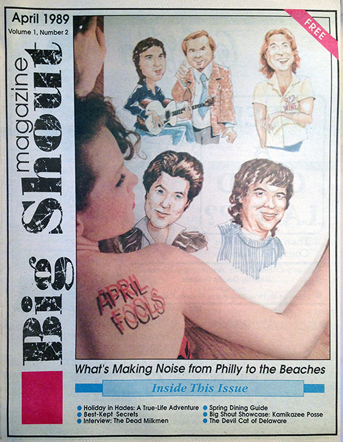
While the magazines were hitting the streets in early March, managing editor Dave Hamill came up with the idea of doing a cover story on local comedians who freelance on area radio stations. The idea was to tie in the comedy angle with the month of April and call it “April Fools.” House artist Curt Wayne was contracted to do the caricatures of the featured comedians, and cover model Kim Kiminski would hold these for the resulting photo.
Well, you know what they say about the best-laid plans… The first problem arose when it became next to impossible to keep the caricatures and Kim in focus together at the same time. The idea of featuring them together sounded good in theory, but when put into practice, it proved to be too complicated. A wide-angle lens was used, but the shot that eventually was taken withe a 50 mm lens.
The next problem occurred when the film was developed and it was found that since we used lamps with tungsten filaments, they cast a yellowish tinge over the entire photo. Reprints were made using a chemical that removed most of the yellow, but the end result still retained a noticeable amount.
Come What May
We felt we had learned a lesson and decided we’d hire a photo artiste after all. We contracted Greg Drew of Wilmington (the guy who told us not to use tungsten lamps anymore).
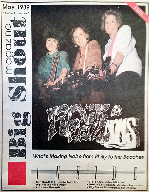
Since Mother’s Day falls in the month of May, we decided to do a story on local rock celebs and their mothers and call the story “Rock & Roll Moms.”
As you might imagine, it proved to be a difficult task getting all of the mothers together for the photo shoot. Luckily, a convenient location was found late in April thanks to the coordination help of our “From Philadelphia” columnist Alan Newman, and the photographer and models met at the Beverly Hills Bar & Grill in Philadelphia for the shoot. The idea of the photo was to have the moms brandishing guitars on the Beverly Hills’ stage, while our photog caught the action.
The resulting photo was a tad dark but quite usable, and some gnarly hand-lettering was added at the bottom of the frame courtesy of Curt Wayne.
All seemed well until the Big Shout staff arrived at the printer as the issues were tumbling off the press. Someone noticed that the photo didn’t look quite right, and then someone else noticed that the Ibanez logo on one of the guitars read, “zenabI.”
It was the first, but certainly not the last time, I would actually yell, “Stop the press!” to the guys running the printing machine. The production people at the printer had inadvertently flipped the photo the wrong way! The presses had to be stopped, the photo was flipped back, another plate was made for the cover, and it went onto the press again. Another hectic deadline, another issue.
Beachhead
June was a breakthrough month for the magazine not only for the cover, but for the entire layout of the issue as well. With the advent of the warmer weather, it was now possible to shoot outside, enabling us to use sunlight to light our shots… instead of tungsten lamps or even photo flashes.
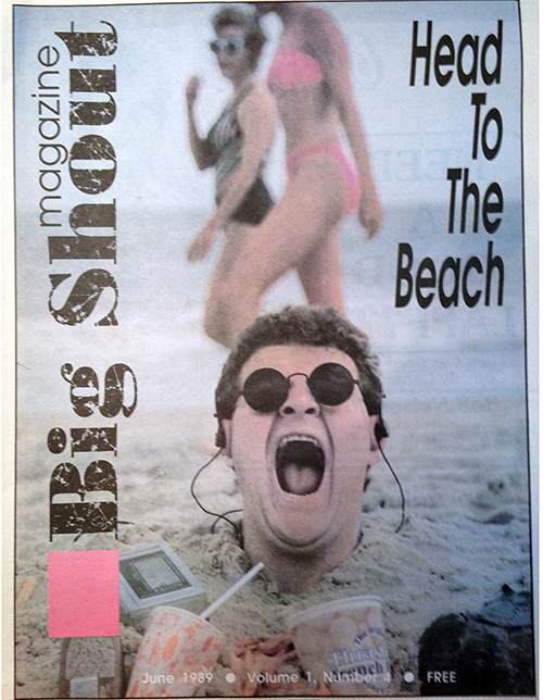
The obvious choice was to have a beach cover in time for the seasonal migration to the shore points, which is ordinarily well underway by early June. We came up with the idea of having someone buried in the sand up to his neck, but we were undecided as to who we should use as a model. We needed someone who was either noteworthy or funny looking — somebody who could draw the readers’ attention in a single glance.
An idea fell right into our laps when freelance writer Mike Walsh handed us a story on Newark institution Jerry “Pumpkinhead” Lehane III. Of course! Why not get Pumpkinhead to be our cover boy? His most distinguishing feature is… er, well, his head after all.
Not only did Jerry readily agree to the photo shoot, he sacrificed a great deal of personal comfort in order to do it. After a long, two-hour drive to the pounding surf, the first thing we did was drag Jerry to the nearest empty spot on the beach and bury him up to his neck. He came fully prepared for the job, wearing only socks and a complete sweatsuit.
The job of digging the hole was volunteered by a number of kids who were already making sandcastles nearby, and it wasn’t long before Pumpkinhead was fully buried, upright in a crouching position. The photographer decided at this point that it would be a good idea to have a container of beach fries and a drink in the frame, and Jerry waited patiently while these items were purchased.
Once they were put in place, a bottle of suntan lotion, a Walkman, and a smelly horseshoe crab were placed inches from Jerry’s sun-beaten face. And then an alarming thing happened. From nowhere, a battalion of seagulls appeared, attracted by the french fries. In between shots, Jerry was buffeted about the head and neck by their talons and beaks. In order to try to achieve a more dramatic shot, the photographer placed several french fries on the model’s head to lure the birds further. Pumpkinhead never protested.
After a good hour-and-a-half of shooting, the only complaint Jerry uttered was, “I don’t think I can feel my legs.” The understanding photo team kidded at this point that it would be a good time to go get something to drink, and they wondered out loud whether or not the tide was coming in. Though Jerry was smiling, the accumulating beads of sweat on his brow gave away that he was now becoming a little impatient.
The end result was successful. Contrary to popular belief, the bikini-clad beachcombers in the background were not planned. They really just happened by at the time the frame was shot, and it was sheer luck that the photo was snapped at the moment they were in line with Jerry giving his best “big shout.”

Born on the Fourth of July
Confidence returned to the Big Shout camp with the success of the beach issue and it’s cover. We decided to follow it up with a summer fashion issue in July.
The entire month was devoted to gathering a small fleet of models to be shot wearing the latest fashions at the beach, in New Castle County, DE and in Philly. After a whirlwind of driving, arranging, scheduling, and finally shooting, there weren’t that many days left in the month to shoot the cover. Not only that, we still hadn’t come up with a cover idea or a model.
At the last minute we grabbed first-time model Amy Facciolo, whom we had used for the fashion shooting in Philly and Delaware. When she showed up for the cover shot, we still had no clue what we were going to do.
It just so happened that at the time, the media was making a big deal of the Supreme Court decision to legalize the burning of the American flag during a public protest. And with Independence Day falling in July, we decided on the spot that we would do something with an American flag. We rushed out to a drug store and purchased one for $9.99.
At first we draped Amy with the stars and stripes, but something didn’t feel right. And then it hit us. Why not call the issue “Freedom of Fashion” and make the flag into some kind of tunic? Why not tell people to wear the flag instead of burning it?
A few female assistants helped Amy out of her clothes and into the homemade “dress” that actually had a bustle in the back. The flag was held together precariously with paper clips and tape — the only things keeping her from giving new meaning to the term “freedom of expression.”
The final effect was stunning. It was perhaps our most visually-pleasing cover, but it was not a beautiful sight to all of our readers. Later that month we received a letter from a gentleman representing the American Legion National Americanism Commission headquarters in Indianapolis. He had somehow come across our July cover and felt that we were displaying a “blatant disregard of proper respect for the Flag…” by showing someone wearing it. He sent us a pamphlet that informed us of the proper flag etiquette, and from this we learned that “the Flag should never be used as wearing apparel, bedding or drapery.” Bedding? Seriously?
Dog Tired in August
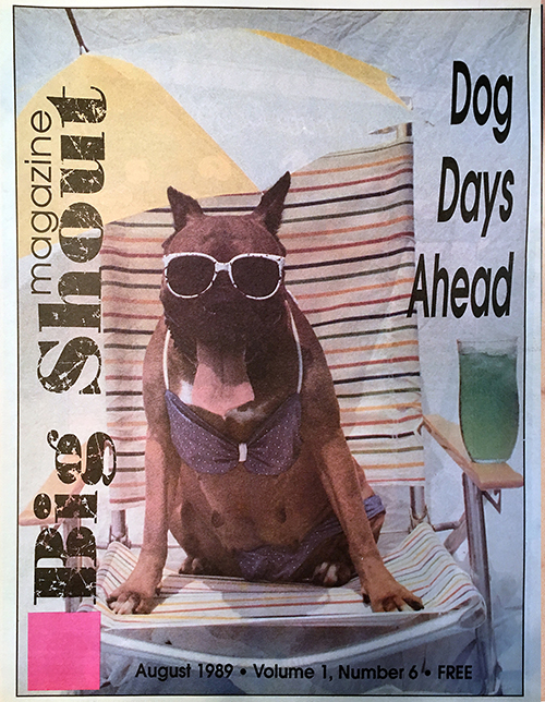
With the weather becoming increasingly hotter and the final dog days of summer approaching, we knew we had to have a dog appear on our August cover. As in the June issue, we were looking for a prospect who was somewhat striking or comical looking, and after an abortive attempt with a poodle, the end of the month found us lacking in dog models.
As luck would have it, Big Shout intern Kirsten Phillippe told the staff that she had a silly-looking boxer named Maxi who would be perfect for the shot. So the dog was hired sight unseen on a sweltering day in July.
This long day began with the photographer showing up at the Phillippe residence to pick up the model for the shoot. When photographer and model met, the latter barked hysterically and had to be restrained by members of the household. After Maxi quieted down, she was escorted to the photographer’s car where she promptly drooled on the upholstery the entire drive to the designated shooting area.
A funny thing happens to boxers when they are left in 100-degree heat for any length of time. They cope with it by producing excessive amounts of drool that forms in foamy pockets all around their lips and mouth. Not only did Maxi exhibit advanced stages of this syndrome, she was also in heat and her underparts were swollen and tender. This made matters difficult when we tried to position her sore dog fanny on a hot and unyielding beach chair.
It took about an hour to set up the backdrop, beach chair, umbrella, colored water, and then attempt to squeeze Maxi into an old bikini. It also took a painful amount of time and coaxing to get off a single shot.
After chasing Maxi around the yard with a pair of bikini bottoms that kept falling off, we gave her a bowl of water and tried to prop sunglasses on her head in such a way that would stay put for more than 20 seconds. She could not be coaxed onto the chair, making it necessary for the photographer to pick Maxi up like a 60-pound baby and carry her to the spot, while getting slimed in the face in the meantime. Once in place, she was good for about five seconds of shooting. If the shot was not taken in that time, she would bolt and have to be retrieved out of the neighbor’s garage a block and a half down the street.
After about seven frames and three hours of this torture in the extreme heat, Kirsten suggested that we take the Maxi back to her house and try shooting there because Maxi obeys her mother better than anyone. This we did, but found that after the pictures were developed, all of the shots taken at the Phillippe home had the dog craning her neck to look at Mrs. Phillippe. The best shot happened to be the very first one taken. If we had known this, we could have saved ourselves a lot of trouble.
W.C. Fields is credited with saying “I’ll never work with children or animals again.” Now we know why.
Flowers of September
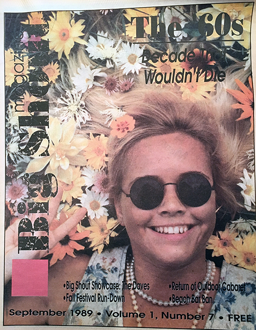
It was mid-August before we came up with the concept for the September issue. We decided to do a homage to the 1960s with a cover shot of a girl lying in the grass with flowers in her hair.
After a failed attempt with a brunette — whose hair proved to be too dark for the photo, making the flowers and the grass too difficult to see — we found a cover girl in Parrish Blue keyboardist Jenny Grodzicki.
Jenny had to endure lying in the grass with flowers and icky bugs in her hair for a good hour and a half. Not only that, the sun was so bright that she couldn’t keep her eyes open without them tearing up. The famous sunglasses used on the first cover were dusted off and used once again — this time for a functional purpose. Jenny actually had her eyes closed during the shooting and the dark shades hid them. If you look closely at the shades in the cover shot you can’t see her closed eyes, but you can see the image of the photographer hovering over her.
Halloween Havoc
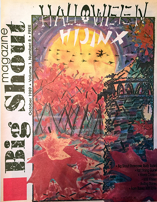
For October’s cover, we thought it was high time to feature something other than a photograph. Big Shout writer and well-known Wilmington artist Tom Watkins had expressed interest several months before about doing a hand-painted cover, and we took him up on it for our Halloween issue.
The original work Tom gave us, featuring a likeness of the Rockford Tower in Wilmington, had a stunning display of color, however, most of its vibrancy was lost during the color separation. When this image was put onto newsprint, it lost even more of its vitality, which was a disappointment to us, but unless you had seen the original, you had no way of knowing.
Not having to arrange and shoot a photograph was a welcome relief, but this month’s cover didn’t come without its problems. When the staff arrived at the printer to see the new issues tumbling off the press, they were alarmed to see that the geese and witch were not visibly flying across the moon. For some reason, the black plate in the color separation wasn’t showing up well, so the editor had to take the actual printer’s negative of the cover and scratch in the geese, the witch, and even Tom Watkins’ signature at the bottom. Luckily, Tom was very understanding, and the general public was none the wiser.
Thanks A Lot
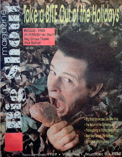
The November issue was begging for a gratuitous Thanksgiving theme, and we soon came up with the idea of having someone pose with a cooked turkey. Rob Dickenson of Life After Elvis was the obvious choice since his band was being showcased that month, and he is well known for being somewhat of a ham.
On the last possible day before deadline, a turkey was cooked, and Rob met us for the shoot. Unfortunately, he arrived just as the sun was going down, making it impossible for us to shoot outside without a flash. After a flurry of panicky phone calls, we contacted photographer Ed Cunicelli and asked to use his studio in Glen Mills, PA. Ed graciously agreed, and we whisked Rob, the photo gear, and two cooked turkey legs into the studio.
On the way there, we came up with a variation on the June cover. Why not bury Rob up to his neck in leaves and have him biting a turkey leg? The only problem was getting enough leaves into the studio to bury Rob properly. We came up with a solution by rigging two saw horses together into a kind of table using poster board as a table top. We cut a hole for Rob’s head and a hole for his hand, and piled three barrels of leaves on top of this rig. It looked ridiculous, but the picture was cropped so tightly that you couldn’t see anything but the leaves, Rob’s grimacing face, and a weather-beaten turkey leg.
Santa and His Helper
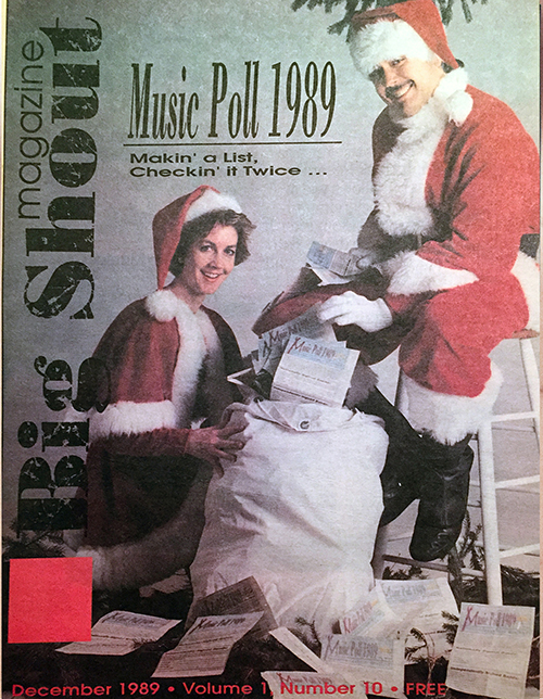
Because of the holidays, we wanted to have a Christmas theme for our December cover. Originally, we planned to have Emo Phillips dressed as Santa Claus with Judy Tenuta sitting on his lap, telling him what she wanted for Christmas. Unfortunately, while Emo was scheduled to appear at the Grand Opera House in Wilmington in December, we couldn’t get both of the comedians together in time for the shoot, and their management didn’t want to have one appear without the other.
We came up with a solution that worked even more to our advantage. December was also the first month that the final ballots appeared in the magazine for the Big Shout/Street Beat Music Poll, and in celebration of this, we asked WMMR’s Buzz Barkley and Cyndy Drue to pose as Santa and his helper, respectively.
We arranged for them to meet at Ed Cunicelli’s studio one snowy day in late November, and they brought with them the perfect Santa outfits, which were provided by Costumes by Pierre of Philadelphia.
We filled a mailbag with old issues and some of the actual nomination ballots we had received, cut some evergreen branches from Ed’s parents’ yard, and Ed let the models do the rest while he snapped away.
New Year, Baby
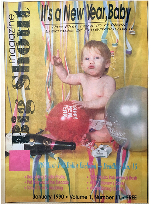
January’s cover, like October’s, was a case where we had a contributor with a preconceived idea submit work to us well before deadline. In this instance, it was photographer Andy Rash who reserved the January slot months ahead of time.
His idea was to take a picture of his daughter Samantha Jayne as Baby New Year. We suggested that he do the shot with empty liquor bottles, crumpled-up packages of Alka Seltzer, streamers and other New Year’s party paraphernalia surrounding his daughter. We pushed it further and suggested she pose with a cigarette butt dangling from her mouth while looking hung over.
Andy wasn’t too keen on the latter suggestion, but he did use streamers, an empty bottle of champagne, balloons, and a crumpled pack of smokes for the final product, which was shot at the studios of Delaware Photographic Services. All Samantha had to do was look cute.
“February Made Me Shiver”
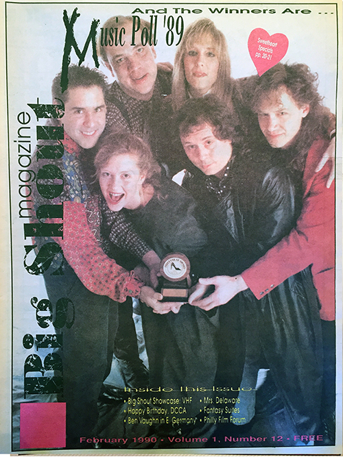
As each month progressed, this cover-shot thing was getting easier and easier. The obvious thing to do for our February cover was to have a shot of the winners of the Music Poll, which we had been hyping for the previous three months.
The most difficult thing about it was scheduling a time when all of the busy musicians could meet at Ed Cunicelli’s studio. Luckily, Mike Mennies (Best Keyboardist), Jim Ericson (Best Guitarist), and Bekka Eaton (Best Female Vocalist) were all fellow members of the band The Daves, and Richard Bush (Best Male Vocalist) and Lynne Davis (Best Bassist) both played in the band Richard Bush and the Candles. It only took a few phone calls to them, rehearsals were postponed, and a single phone call to Ritchie Rubini (Best Drummer) left us with all the instrumental winners for the Best Unsigned Band category.
Of all the shots Ed took, the one that worked the best was the photo with all of the winners crowding around the coveted “Spiked Heel Award.”
March Again
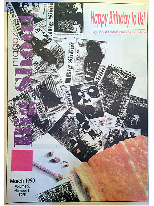
And before we knew it, it was time to come up with a cover concept for our celebratory first-year anniversary issue. We enlisted the services of graphic artist and winner of the “Street Beat Logo Contest,” Christine Kerrick from Philadelphia.
While showing us her portfolio, an idea sprang to mind. Christine had done a nice collage of hand-painted black-and-white photos of Marilyn Monroe with brightly colored pills scattered over them. The contrast of the vivid colors and the monotone images made for a striking visual effect that we wanted to use for our March cover. Instead of using photos, we decided to use black-and-white facsimiles of our covers with a slice of birthday cake and a candle on top of them. Christine used a combination of xerography and hand-painting to achieve the desired effect.
All seemed well until it came time for Christine to mail the finished cover to us. On the last day of the deadline, we grew alarmed that we hadn’t received it yet. After calling Christine, we learned to our horror that she had Federal Expressed it to us but had given a post office box as an address. FedEx cannot deliver to anything but a street address, and we spent the next six hours trying to track down the package with a tracking number Christine gave us.
The color separator was called, and luckily they were willing to push back our deadline to accommodate us, but as our search for the courier continued, the computers at FedEx crashed for the first time in two years! For an excruciating hour, the people at the office could not contact their courier and we could only wait.
One hour before the color separator closed, the cover arrived and we all heaved a sigh of relief. It seems some things don’t get easier with time.
In some ways it feels like it all started only yesterday and in other ways it feels like a millennium has passed by, but the fact of the matter is, Big Shout Magazine has weathered its first year fairly unscathed.
We would like to thank all of the contributing photographers, artists, and cover models who made each cover and each month something to remember.